30-second overview: On the morning of September 8, 2015, justfont’s Jin Xuan typeface launched a crowdfunding campaign on flyingV, broke through its NT$1.5 million target in 76 minutes, and ultimately drew NT$25.93 million from 7,667 backers. This piece begins with the founding of DynaComware in 1987 and follows how an industry read daily by all of Taiwan collapsed, how a community of readers was taught into being, and how the people who make type came into view: Lin Hsia, who began by painting Buddhist images; Chang Chieh-kuan, who cast lead type on Taiyuan Road for half a century; Wang Shui-he, who entered the trade at fourteen painting signs; and the open-source typefaces, Lanyang Ming, and independent designer ecosystem that grew after Jin Xuan.
On the morning of September 8, 2015, a crowdfunding page went live on flyingV. What it was selling had not yet been finished: a typeface called “Jin Xuan,” of whose 14,524 characters only a little over 3,000 had been prototyped. Seventy-six minutes later, the NT$1.5 million target had been broken through12. It was not yet noon.
The numbers then spun out of control: NT$10 million in 11 hours, NT$20 million in 58 hours. By the close of the campaign, 7,667 people had put in a total of NT$25,930,099 for a typeface that had not yet been born1. Facebook was flooded that day, and tens of thousands of people in the comments argued, for the first time, over “what letters should look like.”
Seventy-six Minutes, and Twenty-eight Years
To understand how fast 76 minutes is, one has to measure it against 28 years. In September 1987, Taiwan’s first digital type company, DynaComware, was founded in Taipei34. By the time Jin Xuan went online, the industry had already traveled a full 28 years, including more than a decade in which almost no one believed that “making type” in Taiwan could sustain itself. In the past, a typeface was sold to design firms and publishers, with licensing fees collected year after year. Jin Xuan turned the whole market around by asking readers to pay directly to support a typeface that did not yet exist.
Another launch three months earlier provided the best contrast. On June 8, 2015, Apple introduced its new Chinese system font, PingFang, at WWDC: Traditional Chinese, Simplified Chinese, and Hong Kong versions, each in six weights, developed by DynaLab of Nangang, Taipei, the company formerly known as DynaComware56. From that point on, Chinese-reading iPhone users around the world would read letters drawn by Taiwanese people every day, yet most would never know whose hands they came from.
In Taiwan, type-making had always been this kind of craft. Its products were everywhere: on signs, in textbooks, in MRT station names. Not a single letter carried a signature. What shifted that morning with Jin Xuan was bigger than money. For the first time, a group of readers voted with their money to say they could see these letters, and could see the people who made them.
A CD at Guanghua Market
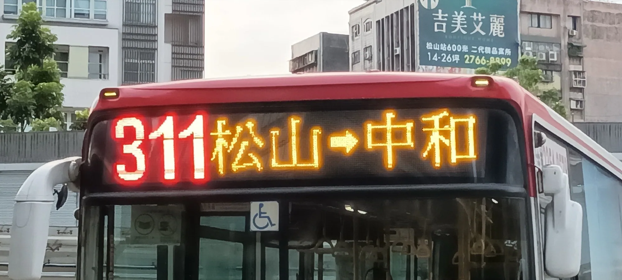
A bus route display on a Taipei street. Ming-style type occupied Taiwan’s official documents, signs, and public transit for decades, a landscape most people read every day but rarely notice. Photo: BlubiNeko, 2022. CC BY-SA 4.0.
The story begins in an era when type was still valuable. In 1992, the Traditional Chinese version of Windows 3.1 shipped with DynaComware’s MingLiU. From then on, the default Chinese on every computer screen came from this Taipei company3. In 1993, DynaComware’s ShaoNv typeface became a fixture of karaoke subtitles and student autograph books. In 1996, Apple put the Li series into the Macintosh3. Even BiauKai was a product of this era: commissioned by the Ministry of Education from DynaComware in 1991 and completed in July 1994, it gave official documents and school reports across Taiwan the same bureaucratic face7. Arphic Technology, founded in 1990, accumulated more than 400 Traditional Chinese typefaces8. Between 1985 and 2000, more than a dozen type-making companies appeared in Taiwan9.
💡 Did you know?
The Chinese typeface you have read most in your life was very likely drawn by the same company. From MingLiU in Windows 3.1 to the later PMingLiU, DynaComware’s letters entered Taiwan’s official documents, theses, reports, and old web pages with every computer (DynaComware official history).
The golden age ended quickly. Around 2000, CD burners became common and P2P spread. At stalls in Guanghua Market, a single “software bundle” CD could hold almost every typeface on the market. The dot-com bubble then burst. Demand and willingness to pay evaporated together. Of the dozen-plus firms, some collapsed and others changed trades, while the survivors shifted their focus to Japan and China9. More than two decades later, in an interview with the Central News Agency, Yeh Chun-lin compressed this history into one sentence: nobody wanted to make type10.
The exit route can be told through two companies. After pivoting toward the Japanese and Chinese markets, Arphic continued to make type and produced Jingshi Hei, the world’s first Chinese typeface supporting the variable font format8. In 2013, Japanese type giant Morisawa acquired a 16 percent stake in Arphic; in 2022 it acquired the company outright, and in April 2026 reorganized it in Taiwan as MORISAWA ARPHIC11. DynaComware, meanwhile, changed its name to DynaLab in 2001 and dug deeply into the Japanese market, where its type market share led year after year3. Taiwan’s type did not disappear, and the companies making it remained. Only the market sustaining them had moved to another country.
Thirteen Thousand and Fifty-three Pits
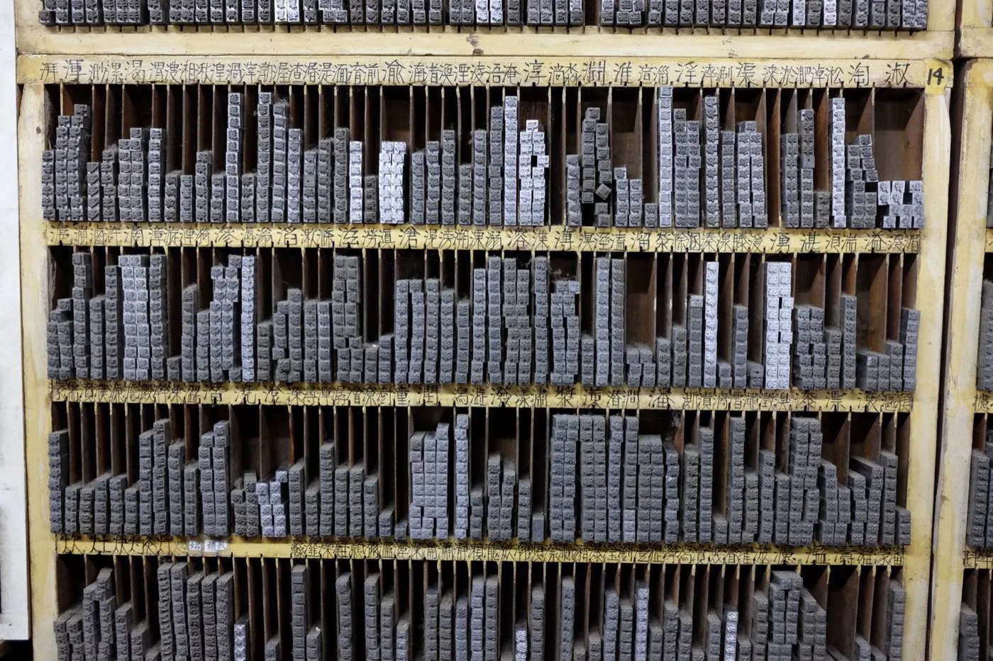
Lead type at Ri Xing Type Foundry. Before digital typefaces, every Chinese character was a physical piece of lead type. The carrier changed across generations, but the scale of more than 13,000 characters never did. Photo: Johan Jönsson, 2023. CC BY-SA 4.0.
After the market collapsed, no one dared take over, and the reason lay in Chinese characters themselves. A Latin typeface can ship with a few hundred characters: uppercase and lowercase letters, numerals, and symbols. A Traditional Chinese typeface needs 13,053 characters merely to cover the basic Big5 encoding set12. Computers cannot help very much: only 20 to 30 percent of the type-making process can be automated, and a single Chinese character can have as many as 24 variant forms13. Quartz put the scale plainly: a Latin typeface can be completed by one designer in six months; a Traditional Chinese typeface takes a team at least two years14.
資料來源:Quartz, 2015
Jin Xuan’s type designer, Tseng Kuo-jung, later described the pace of work to the Hong Kong outlet Goldthread: “In one day, we can only design about 10 characters.” Ten characters a day15. The industry figure justfont founder Yeh Chun-lin has given in interviews is even more precise: an experienced type designer draws an average of 3.8 characters per day16. At that speed, one person working every day without rest would need more than nine years to complete a single weight of one typeface. At this scale, passion is a consumable. Capital is the entrance ticket.
Laying out the character counts of different writing systems shows the mountain Taiwanese type designers faced. Source Han Sans’s 65,535 characters in a single weight are exactly the OpenType format’s limit:
資料來源:Big5 and Unicode character statistics; Adobe, 2014
📝 Curator’s note
The common account attributes the 2000 collapse to piracy. Piracy was certainly the weapon, but the industry’s structure was fragile by nature: one of the world’s largest type-making workloads fell on the smallest yet freest market in the Chinese-speaking world. Japanese and Chinese companies could spread type-making costs of the same order across domestic markets several times larger; Taiwanese companies spread them across 23 million people. That CD at Guanghua Market merely exposed the arithmetic.
Another solution to the problem of scale appeared in 2014. Adobe and Google jointly released the open-source Source Han Sans: seven weights, each filled with 65,535 characters, for a family approaching half a million characters. Glyph production was contracted to type companies in China, Japan, and Korea, mobilizing more than 100 people over three years17. Multinational giants socialized the cost of type-making through open source. Taiwan’s small companies did not have that kind of capital. To survive, they had to find another path.
The People Whose Names Were Not on the Signs
Yeh Chun-lin’s path was to educate readers first. He had spent years at DynaComware18, watching an industry shrink from its golden age into an empty lot no one dared enter. Looking back later in BIOS monthly, he said: “This is sad for a type industry, if we really have such an industry.”19 In 2010, he founded justfont20.
What the company did in its first few years stood some distance away from “selling type.” In 2012 it launched justfont webfont, which it described as the first Chinese webfont service in the Chinese-language world21. Chinese font files were too large, and the web had long been unable to carry them. The webfont service sent only the characters actually used on a page, allowing websites to use chosen Chinese typefaces in real time for the first time. That same year, justfont and type researcher Ko Chih-chieh started the Facebook page “Love Fonts,” teaching people every day how to look at letters on the street, eventually attracting more than 140,000 likes22. Ko then founded the enthusiast group “Zi Hi” in early 201323. In 2014, the two coauthored A Walk Through Type, Taiwan’s first popular science book on Chinese typography24. In the preface to a revised edition, Ko later left behind a line of industry lament: “Why can many domestic designers talk fluently about the difference between Helvetica and Arial, yet cannot tell DynaComware Hei Medium from Arphic Hei Medium at all…”23
The company’s three key people all arrived during this period. Yeh Chun-lin handled product and operations. Type director Lin Hsia had been making type for more than 30 years, and her path into the trade was unusual even in this industry: after graduating from Fu-Hsin Trade and Arts School, she first painted Buddhist images, then moved into type design. Years later, on the company podcast, she spoke about that path in Taiwanese with a Yilan accent: “Actually, painting Buddhas and making type have much in common.”25 Su Wei-hsiang, born in 1989 and a graduate of National Taiwan University’s Department of Chinese Literature, became the first formal employee in 2012 and was later listed as a cofounder. He was responsible for translating type into language the general public could understand18.
This educational track continued after Jin Xuan. In 2018, an online typography course co-run with the illustrator brand Tuwenbufu attracted more than 1,000 students2627. That same year, a survey found that 49 percent of design departments in Taiwan had no typography courses. In 2020, typography classes were brought directly into five elementary schools in Chiayi, Tainan, Kaohsiung, and Pingtung28. In a society that lives on text every day, where nearly half of design departments did not teach how letters look, justfont spent eight years building “eyes for seeing type” as infrastructure.
In retrospect, those 76 minutes in 2015 were the result of five years of groundwork. Webfont, Love Fonts, and A Walk Through Type first educated tens of thousands of readers who could see type. Jin Xuan merely gave them their first chance to act.
A Weight Called Half Sugar
Jin Xuan itself was distinctive enough. Its positioning was written into its launch post: “jf Jin Xuan is a typeface whose style lies between Ming and Gothic, positioned as a ‘second basic typeface,’ combining the rationality of Gothic with the sensibility of Ming”29. The personality of its strokes was also made explicit: “Jin Xuan’s left-falling strokes, right-falling strokes, rising strokes, and dots are relatively firm; its curves bend less roundly, bringing out the force of the strokes, and the tangent angles at stroke endings likewise strive to be clean and crisp.”29
The name itself is another Taiwanese story. Jin Xuan was originally the tea cultivar “Tai Cha No. 12,” bred in 1981 by the Tea Research and Extension Station. Its experimental code was 2027, giving it the nickname “27-a,” and its official name came from the grandmother of Wu Chen-to, the station’s first director30. A grandmother’s name first became a tea, then became a typeface. justfont’s launch post described the reasoning behind the name in two layers: “The reason we named it Jin Xuan is, on one hand, because of this typeface’s ‘mixed’ quality (Jin Xuan is a tea variety whose degree of fermentation lies in the middle, leaning toward unfermented); on the other hand, the stroke shapes are firm, matching the impression of ‘jin,’ or metal; within the tension of thick-thin contrast, an elegant flavor also emerges, suggesting the tea aroma of ‘xuan.’”29
This name almost did not exist. Years later, Lin Hsia recalled on the same podcast episode that Jin Xuan had nearly been called “Iron Branch” or “Matteo Ricci”25. After the final decision, the Taiwanese flavor was carried through completely: “Precisely because ‘Jin Xuan’ is an authentic Taiwanese tea, when creating the various typeface-file features, we also wanted to integrate, and even pay homage to, Taiwan’s distinctive hand-shaken drink stand culture.”29 The weight names were therefore taken straight from the counter of a hand-shaken beverage shop: 20 percent sugar, light sugar, 40 percent sugar, half sugar, and 80 percent sugar29.
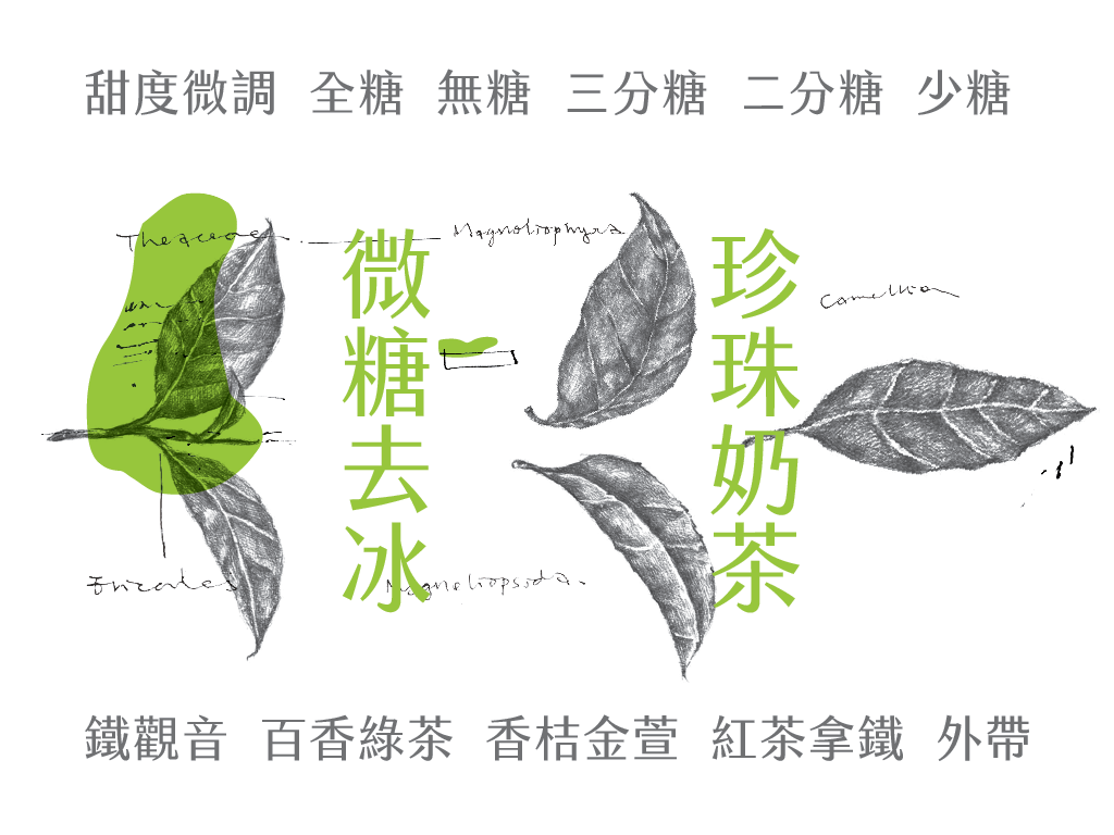
The official specimen from the Jin Xuan launch post, using hand-shaken drink vocabulary as sample text. Image: © justfont, materials provided by justfont, fair use editorial commentary under cooperative authorization. Source.
The typeface contained 14,524 characters, adding zhuyin phonetic symbols, romanization marks for Taiwanese and Hakka, and commonly used Cantonese characters beyond Big531. Behind the numbers was a four-person team. When the campaign launched, only a little over 3,000 characters had been prototyped, and the earliest batch of 300 completed characters had been thrown out and redone from scratch32. Two years later, in an interview with Business Next, Su Wei-hsiang still described it as a fight against monsters far above their level33.
Money came in quickly, and so did criticism. On the campaign’s third day, a PTT user criticized it as a commercial act under the banner of Taiwan34. Publisher Tung Fu-hsing questioned whether people were in fact preordering a privately licensed corporate typeface35. Glyph enthusiasts raised an even more technical problem: Jin Xuan’s connected grass radical did not match the Ministry of Education’s standard written form. justfont answered directly in its official FAQ: “Does the Jin Xuan series follow Taiwan Ministry of Education specifications? No.” The company’s position was that Ministry of Education standards govern handwritten regular script, while print type has its own traditions. The connected grass radical was a design choice made for balance in print-type layout; users who needed the Taiwan standard form could switch through OpenType variant characters31.
📝 Curator’s note
Behind the grass-radical dispute was a question hidden for more than 30 years: there has never been a consensus on “what Taiwan’s characters should look like.” The Ministry of Education’s Standard Form of National Characters, promulgated in 1982, used the handwriting logic of regular script to regulate print glyphs. From that day on, handwriting standards and print traditions were in conflict. The Jin Xuan debate merely brought the two camps into the same comment section for the first time.
The industry’s response was more direct. The campaign page claimed that Taiwan had produced fewer than five domestic typefaces in the preceding decade. Arphic Technology’s Yang Shu-hui publicly rebutted this, stressing that Arphic had never left the Chinese typeface market36. Read together, the marketing copy and this rebuttal form the industry’s own Rashomon: one side saw a rupture, the other saw survivors who had been ignored.
The test came with delivery at the end of 2016. Packaging-bag specifications were wrong, logistics jammed, shipping was delayed six weeks, some discs arrived moldy and scratched, and the company’s own font-management program was unstable, also raising DRM concerns. The official explanation was unsparing: “Because using the typeface through justfont store agent was not part of the originally sponsored plans, and because the program’s stability and support across operating systems were not ideal, it caused inconvenience to many backers.” Yeh Chun-lin apologized publicly and opened direct downloads to all backers37. A company of fewer than ten people, with no prior physical-product experience, learned for the first time what logistics for more than 7,000 people meant.
The wounds from shipping scabbed over, and the family still grew according to plan. After the sugar levels were filled in one by one, Jin Xuan Latte, released in 2018, instead blended Ming with rounded type. The official analogy again came from the beverage counter: “the elegant side is likened to the tea aroma, and the rounded thickness to milk”38.
The story’s international positioning also became clearer. In 2019, Su Wei-hsiang brought Jin Xuan to the ATypI international typography conference in Tokyo, with a talk describing it as the world’s first crowdfunded East Asian ideographic typeface39. Speaking to Hong Kong media about Taiwan’s situation, he put it more bluntly: “When [mainland] China started producing everything, Taiwan was forgotten. Now everyone from Taiwan is looking for a new identity.”15 A crowdfunded typeface, it turned out, was also a search for identity.
justfont’s official crowdfunding video (2015). The main video on the flyingV project page explained to still-hesitant readers why a typeface takes so many years to make.
A Reply From Kyoto
Jin Xuan’s next battle began in Kyoto. In March 2020, justfont discovered that “Jin Hei,” the graduation project of a Chinese student at Kyoto Seika University, was highly similar to Jin Xuan. After character-by-character comparison, the company concluded it was a derivative work40. The university’s first investigation response cited Japanese precedent and deemed the work original, on the grounds that legal protection for typefaces is limited to begin with41.
justfont published the comparison results, Taiwanese media followed up, and the incident spread through design circles. Under public pressure, the university launched a second investigation, and the conclusion reversed. In a formal reply, it confirmed that the student had used portions of Jin Xuan’s glyphs in making the work. The punishment was written in black and white: “All credits earned by the student in the semester during which this incident occurred will be canceled, and I, as president, have also issued a stern admonition to the supervising instructor”42. Yeh Chun-lin made the whole process public on Medium, leaving one lament: “That protection for type design under the law should be so weak is truly disheartening”42.
That weakness has a legal structure. Most jurisdictions protect typefaces in similar ways: they recognize them as works of art, but infringement usually requires the theft of an entire font library, while imitation of individual glyphs is difficult to pursue40. Type companies therefore build their business on software licensing, charging according to installation and scope of use. For the same reason, the real threshold for a Chinese type company going global is the volume of content in its font library.
The gray zone of copyright had an earlier chapter in Taiwan. Wang Han-tsung, a professor in the Department of Mathematics at Chung Yuan Christian University, donated 42 free GPL-licensed typefaces in two waves in 2000 and 2004, and they were once standard fixtures in free-software circles43. In 2005, Arphic Technology alleged that 14 of them were extremely similar to its own typefaces, and several free-software websites removed the fonts43. The cwTeX fonts circulating in academia around the same period, five of which were released under the GPL between 1999 and 2004, consolidated as cwtex-q-fonts in 2008, and relicensed under the OFL in 2014, still carry similar questions about provenance44. The type industry broadly reads this batch of “free typefaces” as controversial cases in which commercial typefaces were copied and then open-sourced.
⚠️ Verification boundary
The Wang Han-tsung case never produced a court judgment. The allegations and degree of similarity above follow community records such as Wikiversity and have not been judicially determined.
The Tapioca Pearls Given Away
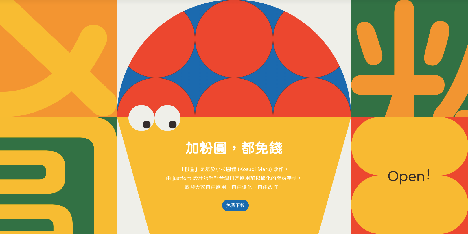
The official visual for jf open Huninn. This open-source rounded typeface was adapted from Japan’s Kosugi Maru and released under the OFL after zhuyin and Taiwan-specific common characters were added. Image: justfont official GitHub. Source.
The first chapter of Taiwan’s “free type” carried original sin, which made another batch of free typefaces 15 years later feel precious. On March 14, 2020, justfont released the open-source typeface “jf open Huninn” on GitHub under the most permissive OFL license, allowing free commercial use45. It was adapted from the Japanese company Motoya’s Kosugi Maru. The team added 1,477 common characters absent from the original for Taiwanese users, along with zhuyin phonetic symbols and Taiwanese romanization45. This typeface had been an unlocked stretch goal promised on the Jin Xuan crowdfunding page. Five years later, justfont fulfilled it, with clean provenance.
💡 Did you know?
Huninn’s base, Kosugi Maru, was designed for Japanese users. It had no zhuyin phonetic symbols and lacked more than 1,400 characters commonly used in Taiwan. By completing these characters and then open-sourcing the result (GitHub release page), the justfont team effectively naturalized a Japanese typeface into a Taiwanese one.
This open-source line kept extending. Ko Chih-chieh, using the online name But Ko, adapted the Source Han series into a series of open-source typefaces including Genyo Mincho and Genryu Mincho46. In 2023, justfont released the jf7000 Dangwu character set, pairing 7,000 contemporary common characters with extended character tables. It filled gaps for people long overlooked by mainstream typefaces: those writing their own names and mother tongues in Hakka, Indigenous languages, and Taiwanese romanization systems finally had fewer missing characters47. The debt of the first chapter was repaid by the second.
Rain Retrieved From Woodblocks
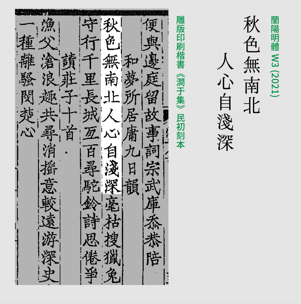
Official comparison of Lanyang Ming and the woodblock characters of _Jianyuji. The brush movement of carved regular script was translated into the skeleton of a modern Ming typeface. Image: © justfont, materials provided by justfont, fair use editorial commentary under cooperative authorization. Source._
On the commercial track, Lin Hsia wanted to make a deeper typeface after Jin Xuan. She encountered Jianyuji, a woodblock-printed collection from the early Republic period, and was drawn to its lively forms. The idea arose to bring carved regular script back into the present: “Since Ming type originated in woodblock-printed regular script, what would it look like if translated into modern Ming?”48 Only after more than a year of study did the team discover that the collection’s author, Zhang Peilun, was Eileen Chang’s grandfather49.
This typeface is called Lanyang Ming. Lanyang is an old name for Yilan, and Lin Hsia’s childhood was spent by its creeks. Years later, she described her hometown to Unitas: “The first impression is freshness and openness, and also warmth. That is the part of Yilan that cannot be separated from my life, a component that remains in my blood.”50 By signing the name of her hometown onto her deepest work, the typeface aimed at the increasingly rigid Ming skeleton that had emerged after the phototypesetting era of the 1980s, seeking to return to the breathing quality of woodblock type. Lin Hsia put it directly: “Modern digital-feeling creation has already reached its peak. At this stage, I want to make work with more emotion.”49
From November 3, 2021, to January 13, 2022, Lanyang Ming was crowdfunded on WaBay, raising more than NT$20 million20. The full family was planned in multiple weights, with two delivered first after the campaign ended48. Before the typeface was fully completed, its characters had already been used in the title cards and promotional materials for the PTS period drama Gold Leaf51. The forms retrieved from woodblocks returned to the public eye for the first time in a story about Hsinchu tea merchants in the 1950s.
The opening sequence of _Gold Leaf from the official PTS drama channel. Before Lanyang Ming was delivered, the production team had already used this Ming typeface translated from woodblocks in title cards and promotion._
Type Begins to Bear People’s Names
Between Jin Xuan and Lanyang, justfont also grew a third path: helping other people’s typefaces be born. Liu Hsien-lung, designer of Taiwan Road Font and known in the community as Tang Liu, began in 2018 bringing drafts to Lin Hsia for correction after work once every two weeks, continuing for years52. Shih Po-han moved into the justfont office in 2018 for mentorship; his Cream Font launched on zeczec in 2019, becoming the first case released through the “Friends of Type” program53. Lin Fang-ping was still a typography-course student in 2017. In 2020, the Chiron Hei typeface she designed raised NT$13.5 million from 4,700 backers54.
As the list grew, it also began looking toward the street. Taiwan’s streets were already a free typography exhibition. Taichung sign painter Wang Shui-he entered the trade at fourteen and trained more than 400 apprentices in his lifetime. The “Shuihe Rounded” letters on the Miyahara Ophthalmology sign are still his hand: rectangular skeletons, a high center of gravity, and a period quality immediately visible when placed beside modern rounded type55. justfont designer Shen Tsai-jou wanted to bring this “human flavor” into the computer. She visited old-street signs, old book titles, and temple duty plaques to collect letterforms, then worked according to the old masters’ rules: deliberately making no draft, marking only gridlines on the paper, and applying ink directly with the brush5657. The result was Kamabit, a Tâi-gí term for tomato, which went online in early 202557.
The official key visual for Kamabit, paying tribute to hand-painted display lettering on old signs. Image: © justfont, materials provided by justfont, fair use editorial commentary under cooperative authorization. Source.
Yang Tsung-lieh’s typeface, by contrast, was a wager of time. At a turning point in his life, he entered type design and treated drawing letters as an outlet. Over eight years he accumulated nearly 10,000 characters and turned them into a variable font rare in the Chinese-speaking world. Before this “Tear Font” opened for crowdfunding, it had already won the Popularity Award in the 2016 Morisawa Type Design Competition in Japan5258.
These typefaces all bear their designers’ own names, while justfont steps back into the position of design mentor and publisher. By 2023, crowdfunding for typefaces promoted by justfont’s incubator for independent designers, Type Friends Society, had exceeded NT$45 million in total58. Beyond publishers and large corporations, Taiwan gained another way for a typeface to be born: first come thousands of readers willing to wait two years; then comes the type.
📝 Curator’s note
This is the quietest reversal in the whole story. In the old industry, designers entered companies to draw type; the type belonged to the company, and their names remained on attendance sheets. The Friends of Type program reverses the relationship: the company helps designers bring their typefaces out, and the type bears a person’s name. The people whose names were not on signs 30 years ago now have names, one by one.
A Relay at Three Hundred and Forty Degrees
The oldest baton in this relay is on Taiyuan Road in Taipei’s Datong District. Ri Xing Type Foundry opened in 1969. In a roughly ten-ping type-casting room down an alley, casting machines heated to 340 degrees Celsius melt lead into liquid, click-clacking as bright, scorching rows of lead type emerge5960. Around 2000, peer businesses such as Chung Nan Printing shut down one after another, and Ri Xing became Taiwan’s last operating type foundry. The shop holds one of the world’s most complete surviving collections of matrices for lead type in regular script, Song, and Gothic styles6061.
Second-generation proprietor Chang Chieh-kuan began following his father into the trade at seventeen59. In the shop’s heyday, all seven casting machines ran at once: “The masters stripped down to only their underwear and were still sweating from head to toe!”59 Later, as the printing industry changed eras, the work he guarded gained another task: repairing characters. Matrices wear down with use, and the lead type cast from them comes out with missing corners and broken strokes, each one needing to be repaired. After decades of repairs, he described the work like a discipline: “Everyone interprets written characters differently. Repairing type is different from type design; one has to remove the ‘self,’ and that is actually very difficult.”59
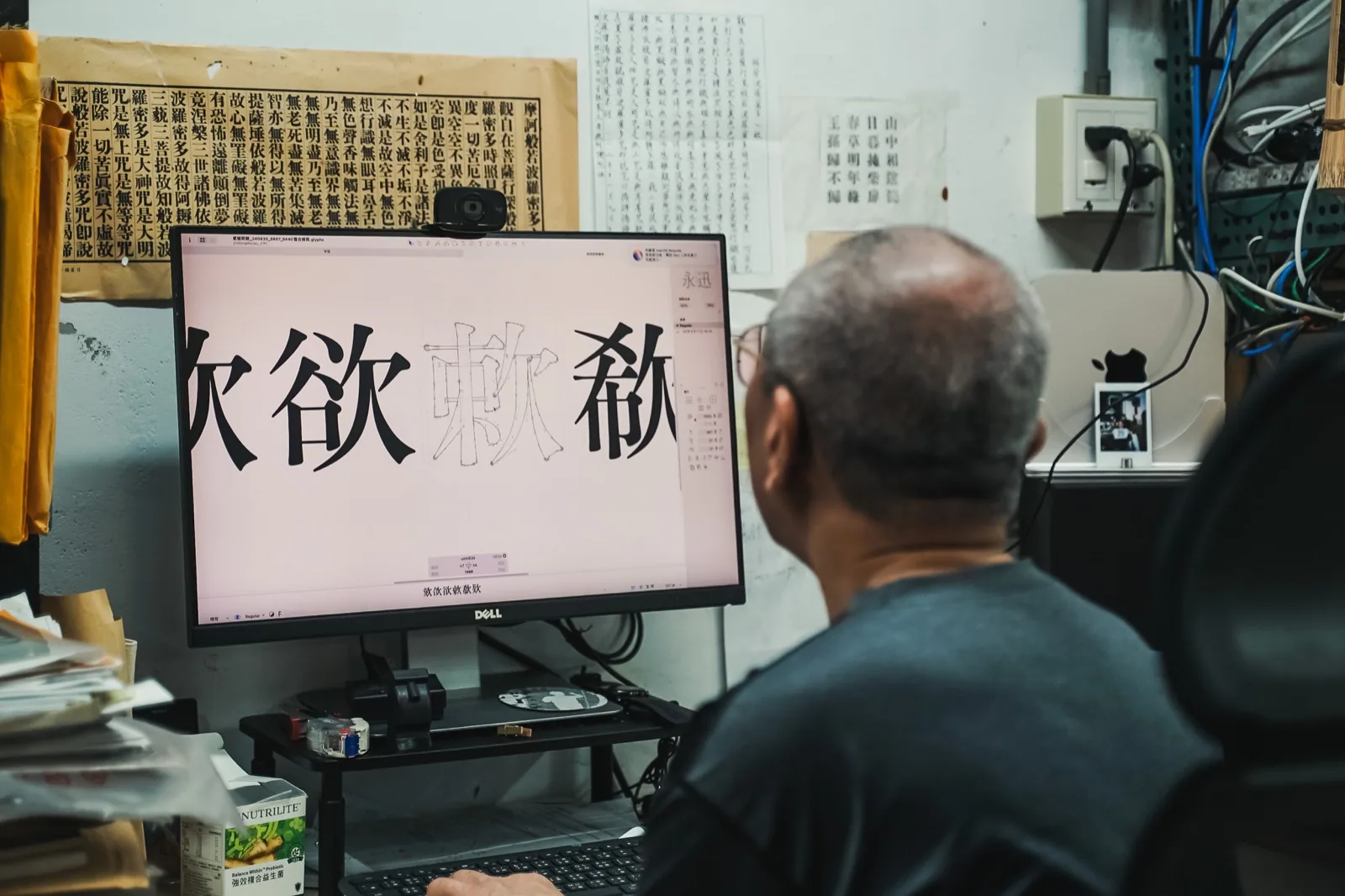
Chang Chieh-kuan repairing digitized glyphs before a screen. The craft of type repair from the lead-type era continues on vector curves. Photo: © justfont, materials provided by justfont, fair use editorial commentary under cooperative authorization. Source.
From 2008, type repair became a public relay. Ri Xing launched a matrix restoration project, and from 2016 onward advanced it through crowdfunding. A single matrix can produce about 10,000 pieces of lead type, while the digital files accumulated through restoration later bore unexpected fruit60. In June 2025, Ri Xing and justfont jointly launched crowdfunding for “Ri Xing Song No. 2,” organizing glyphs repaired from lead type into a computer-usable font file. The campaign succeeded. On March 31, 2026, the typeface opened for backer download6062.
Chang Chieh-kuan once gave this craft a coordinate: “As a carrier of culture, ‘type’ carries the industry’s past, present, and future.”59 From 340-degree molten lead to font files on a screen, Taiwan’s type did not break between generations this time.
Beginning in 2024, Taipei Metro, in consideration of elderly passengers and passengers with dementia, gradually replaced station-name signs that had mixed typefaces for decades with a clean-stroked Gothic typeface63. There was no launch event, no crowdfunding page, and most people passing by did not even look up. When the craft of type is done at its best, no one is supposed to notice.
The difference came after that morning in September 2015. Now tens of thousands of people in Taiwan know that the unsigned letters on signs, in stations, and in textbooks were each drawn stroke by stroke by someone. Among them, 7,667 people can say that one typeface exists because they decided, over the course of 76 minutes, to let it exist1.
Further reading:
- The Reporter: The Ten Years That Rescued Investigative Reporting From a Business Line Into a Public Good: another story of Taiwanese readers voting with money to sustain a public good, where donors relate to The Reporter as backers relate to Jin Xuan.
- Taiwan New Media Art: another group of Taiwanese creators standing at the intersection of design, technology, and cultural identity.
- Social Movements and Civic Participation: the kind of energy in the Jin Xuan debate, where people argued over public affairs, has a larger context in Taiwanese society.
- Submarine Cables: another kind of infrastructure everyone uses every day, yet almost no one sees.
References
Image Sources
- Cover image: Main visual from the Jin Xuan typeface flyingV crowdfunding page. © justfont / flyingV, fair use editorial commentary. Source: flyingV project page
- Taipei bus route display: Photo: BlubiNeko, 2022, CC BY-SA 4.0, via Wikimedia Commons
- Ri Xing Type Foundry lead type: Photo: Johan Jönsson, 2023, CC BY-SA 4.0, via Wikimedia Commons
- Official Jin Xuan specimen: © justfont, materials provided by justfont, fair use editorial commentary under cooperative authorization. Source: justfont blog Jin Xuan launch post
- Official jf open Huninn visual: © justfont, released in the official GitHub repo (font itself under OFL 1.1). Source: open-huninn-font
- Comparison of Lanyang Ming and Jianyuji: © justfont, materials provided by justfont, fair use editorial commentary under cooperative authorization. Source: justfont Lanyang Ming official page
- Official Kamabit specimen: © justfont, materials provided by justfont, fair use editorial commentary under cooperative authorization. Source: justfont Kamabit official page
- Work photo of Chang Chieh-kuan repairing type: © justfont, materials provided by justfont, fair use editorial commentary under cooperative authorization. Source: justfont blog Ri Xing Song No. 2
- flyingV: Jin Xuan typeface crowdfunding project page — Primary crowdfunding record: total NT$25,930,099, 7,667 backers, NT$1.5 million target.↩
- justfont English blog: The Story of Jin Xuan Crowdfunding — justfont’s official retrospective, recording word-for-word that Jin Xuan “hit its target in just 76 minutes.”↩
- DynaComware official company history — Primary corporate history: founded in 1987; MingLiU adopted by Traditional Chinese Windows 3.1 in 1992; Li series adopted by Apple in 1996; renamed DynaLab in 2001.↩
- Wikipedia: DynaLab — Records DynaComware’s founding in Taipei in September 1987 as Taiwan’s first digital type company and its 2001 renaming as DynaLab.↩
- AppleInsider: Apple targets China, Japan with new OS X El Capitan system fonts — English report on the 2015 WWDC announcement of PingFang, recording updates to the new system font and input methods.↩
- Wikipedia: PingFang — Entry on the PingFang typeface, recording that it was developed by DynaLab and covers Traditional, Simplified, and Hong Kong versions, each in six weights.↩
- justfont blog: The life of the hated BiauKai (2014-11) — Primary research tracing the Ministry of Education’s 1991 commission to DynaComware for BiauKai and its completion in July 1994.↩
- INSIDE: Morisawa acquires Arphic Technology — Records Arphic’s founding in 1990, accumulation of more than 400 Traditional Chinese typefaces, and Jingshi Hei as the world’s first Chinese variable font.↩
- The News Lens: The rise and fall of Taiwan’s type industry — Summarizes the golden age of more than a dozen firms between 1985 and 2000, and the rupture caused by CD burners, P2P, software bundle discs, and the dot-com bubble.↩
- Central News Agency: Cultural feature on Taiwan’s type industry (2024) — 2024 in-depth report reviewing the rupture in Taiwan’s type-making industry and the situation of practitioners.↩
- Morisawa official press release: Arphic acquisition — Morisawa’s primary material, recording its 16 percent investment in 2013, full acquisition of Arphic in 2022, and subsequent reorganization.↩
- Wikipedia: Big5 — Entry on Big5 encoding; source for the 13,053-character total from 5,401 frequently used characters plus 7,652 less frequently used characters.↩
- The News Lens: A single Chinese character can have as many as 24 written forms — Report on the limited automation of Chinese character type-making and details on the number of variants.↩
- Quartz: The long, incredibly tortuous process of creating a Chinese font — English feature comparing the scale of work between a Latin typeface by one person in half a year and a Chinese typeface by a team over many years.↩
- Goldthread: These guys spent 4 years making a Chinese font — 2018 English interview recording Tseng Kuo-jung’s original remark that they could design only about ten characters a day.↩
- INSIDE Tech Spicy Soup E388: Interview with Yeh Chun-lin — Interview record mentioning the industry figure of 3.8 characters per day on average for an experienced type designer.↩
- Adobe: Introducing Source Han Sans — Adobe’s official launch post, recording 65,535 characters per weight, nearly half a million characters in the full family, and more than 100 people mobilized over three years.↩
- Wikipedia: justfont — Records company history: Yeh Chun-lin’s DynaComware background, 2010 founding, and Su Wei-hsiang joining in 2012 as the first formal employee.↩
- BIOS monthly: justfont interview — Records Yeh Chun-lin’s original remarks on the situation of Taiwan’s type industry and his motivation for founding the company.↩
- justfont official website: About us — Company’s primary self-description: founded in 2010, three cofounders, history of the Friends of Type program and various typeface projects.↩
- justfont webfont service introduction — Primary self-description: the first website in the Chinese-language world to launch a Chinese webfont service.↩
- Facebook page: Love Fonts — Typography popularization community jointly operated by justfont and Ko Chih-chieh, with more than 140,000 followers.↩
- Faces Publishing: Preface to A Walk Through Type Next (Ko Chih-chieh) — Full primary preface, including the founding of the Zi Hi group in early 2013 and the lament about being unable to distinguish DynaComware Hei Medium from Arphic Hei Medium.↩
- Wikipedia: A Walk Through Type — Entry on Taiwan’s first popular science book on Chinese typography, published in 2014.↩
- A Knob of Font EP.12: Jin Xuan series ft. design director Lin Hsia — Official program page recording Lin Hsia’s path from Fu-Hsin Trade and Arts School and Buddhist image painting into type design, and anecdotes that Jin Xuan nearly had the names “Iron Branch” or “Matteo Ricci.”↩
- justfont blog: Record of online typography course launch — Primary record of the Hahow online course co-run with Tuwenbufu and the scale of enrollment.↩
- Hahow: Flexible Typography Course page — Primary course page; enrollment scale can be checked directly (already exceeding 1,000 students in 2018).↩
- justfont typography education outreach project — Primary project page including the 2018 survey finding that 49 percent of design departments had no typography courses.↩
- justfont blog: Jin Xuan launch post (2015-08-07) — Primary source for Jin Xuan’s positioning as a “second basic typeface,” the two-layer naming logic, and hand-shaken drink sugar-level weight names.↩
- Wikipedia: Tai Cha No. 12 — Entry recording its 1981 breeding by the Tea Research and Extension Station, experimental code 2027, and name derived from the grandmother of first station director Wu Chen-to.↩
- justfont: Jin Xuan FAQ — Official FAQ primary material, including the composition of 14,524 characters and the official answer on whether it follows Ministry of Education specifications.↩
- Yeh Chun-lin on Medium: Looking back at Jin Xuan — Primary retrospective: only a four-person team at the time of crowdfunding, first 300 prototype characters scrapped and redone, and just over 3,000 characters completed before launch.↩
- Business Next: justfont interview — 2017 interview in which Su Wei-hsiang recalls the Jin Xuan crowdfunding campaign as a fight far above their level.↩
- PTT WomenTalk board: Jin Xuan crowdfunding discussion thread (2015-09-10) — Primary archive of criticism during the campaign, questioning the relationship between commercial activity and Taiwan symbols.↩
- INSIDE: Summary of the Jin Xuan crowdfunding debate — Summarizes questions from Tung Fu-hsing and others about the model of preordering a privately licensed typeface (secondary source).↩
- TechNews: Arphic responds to Jin Xuan crowdfunding (2015-09-11) — Reports Arphic’s Yang Shu-hui publicly rebutting the campaign page’s claim that Taiwan had produced fewer than five domestic typefaces in ten years.↩
- justfont blog: Jin Xuan shipping explanation and apology (2016-12) — Official primary admission and full explanation of shipping delays, disc damage, and problems with the font-management program.↩
- justfont blog: Jin Xuan Latte new typeface launch (2018-08) — Primary launch summary, including the design blending Ming and rounded type and the official analogy of tea aroma and milk.↩
- ATypI Tokyo 2019: Jin Xuan, the world's first crowdfunded East Asian ideographic typeface — Official talk page from the international typography conference, primary source for Jin Xuan’s international positioning.↩
- TechNews: justfont responds to the Jin Hei incident (2020-03-17) — Report on the Jin Hei comparison results and the legal protection framework for typeface copyright.↩
- Liberty Times: Kyoto Seika University graduation work controversy — Records the university’s initial investigation response, which deemed the work original and cited Japanese precedent.↩
- Yeh Chun-lin on Medium: Kyoto University’s reinvestigation and reply — Primary documents: Japanese original and Chinese translation of the university’s second investigation reply, credit-cancellation punishment, and Yeh Chun-lin’s reflections.↩
- Wikiversity: Wang Han-tsung free fonts — Community summary of the history of Wang Han-tsung’s 42 GPL fonts and Arphic’s 2005 allegation and takedown sequence.↩
- GitHub: cwtex-q-fonts — Open-source repository organizing the cwTeX fonts, recording the 1999-2014 license evolution and provenance background.↩
- GitHub: jf open Huninn — Primary repository recording adaptation from Kosugi Maru, addition of 1,477 Taiwan-specific common characters, zhuyin and Taiwanese romanization, and OFL 1.1 licensing.↩
- GitHub: Genyo Mincho (But Ko) — Primary repository for But Ko’s open-source Ming typeface adapted from the Source Han series.↩
- justfont blog: jf7000 Dangwu character set — Primary release post explaining 7,000 common characters and extended character tables for Taiwanese, Hakka, naming characters, and other uses.↩
- WaBay: Lanyang Ming crowdfunding page — Primary crowdfunding page including the origin story of Lin Hsia’s encounter with Jianyuji and the design concept.↩
- justfont: Lanyang Ming official page — Primary material: structure derived from Jianyuji, the relationship between Zhang Peilun and Eileen Chang, and Lin Hsia’s creative statement.↩
- Unitas: Dialogue with Lin Hsia — Dialogue record including Lin Hsia’s original remarks on her Yilan childhood and impressions of her hometown.↩
- Wikipedia: Lanyang Ming — Entry recording the crowdfunding period, delivered weights, and advance use in the title cards of Gold Leaf.↩
- WaBay: Taiwan Road Font crowdfunding page — Primary statement by designer Liu Hsien-lung, who calls himself Tang Liu: “Starting in 2018, almost every two weeks I would choose one day after work to bring my drafts to Sister Hsia for correction.”↩
- justfont blog: Cream Font is coming — Primary record of Shih Po-han’s Cream Font crowdfunding campaign and the background of the first Friends of Type case.↩
- justfont blog: A Knob of Font S1E12 Lin Fang-ping — Primary record of Lin Fang-ping’s path from typography-course student to designer of Chiron Hei.↩
- Roomie: Visiting the lettering master behind the Miyahara Ophthalmology sign — Records Wang Shui-he’s becoming a signboard master at age 14, training more than 400 apprentices, and the rectangular skeleton and high center of gravity of Shuihe Rounded.↩
- justfont blog: Kamabit design story (2023-11) — Primary design record of Shen Tsai-jou’s hand-drawn process: deliberately making no draft, marking only gridlines, and applying ink directly.↩
- justfont: Kamabit official page — Primary material: Kamabit is a Tâi-gí term for tomato; the designer visited old-street signs, old book titles, and temple duty plaques to collect letterforms.↩
- La Vie: Tear Font crowdfunding project launches — Reports Yang Tsung-lieh’s eight-year, nearly 10,000-character process, the 2016 Morisawa Type Design Competition Popularity Award, and Type Friends Society’s cumulative crowdfunding total exceeding NT$45 million.↩
- Taipei City Government Department of Economic Development: Portraits of craftspeople, doing one thing well for a lifetime (Part 2) — Official publication interview recording Chang Chieh-kuan entering the trade at seventeen, the 340-degree type-casting room, the era of seven casting machines, and his type-repair philosophy.↩
- justfont blog: Ri Xing Song No. 2, digitally restored typeface (2025-06) — Primary record: Ri Xing’s opening in 1969, history of the matrix restoration project, the approximately 10,000-piece lifespan of one matrix, and organization into a digital typeface.↩
- Wikipedia: Ri Xing Type Foundry — Records that after Chung Nan Type Foundry closed in 2000, Ri Xing became Taiwan’s only remaining type foundry.↩
- WaBay: Ri Xing Song No. 2 crowdfunding page — Primary crowdfunding page recording backing progress and the March 31, 2026 opening of downloads.↩
- United Daily News: Report on Taipei Metro station-name sign replacement — Reports Taipei Metro’s gradual unification of station-name typefaces from 2024 for elderly passengers and passengers with dementia.↩