30-second overview: Aaron Nieh (born 1977) is the first Taiwanese designer admitted to the Alliance Graphique Internationale (AGI), and has won the Golden Melody Award for Best Album Packaging three times. He has designed music covers for Yoga Lin, Sodagreen, Jolin Tsai, and Hebe Tien, as well as book covers for Rye Field, China Times Publishing, INK, and Linking Publishing; the 4 a.m. New York Times advertisement during the 2014 Sunflower Movement and the 2020 “Taiwan Can Help” New York Times crowdfunding campaign both came from him; Tsai Ing-wen’s 2016 campaign identity “Light Up Taiwan” and the main visuals for two presidential inaugurations were also handled by him and his studio. Aaron Nieh Workshop established a second base in Kaohsiung’s Pier-2 warehouse district in 2024, and beginning that same year consecutively won identity-system projects for Taipower, CPC, the Tourism Administration, and the Ministry of Economic Affairs. On the day Taipower’s new logo went online in 2026, a controversy over “political patronage” erupted, to which he responded with a five-point statement. The line he has repeatedly emphasized, “before he was designer Aaron Nieh, he was citizen Aaron Nieh,” has, from 2014 to the present, been reread again and again from different positions.
If one were to lay out the commissions Aaron Nieh has taken over the past two decades, his designs would look like a list spanning parallel industries. In pop music, there are Sodagreen, Yoga Lin, Mayday, Hebe Tien, and Jolin Tsai. In books, there are Rye Field, China Times Publishing, INK, Linking Publishing, and book covers for writers such as Lo Yi-chin and Gan Yao-ming, many of which passed through his hands1. In commercial branding, there are 7-ELEVEN CITYCAFE, UNIQLO Tomorrow Taipei, CTBC cards, and Kuo Yuan Ye. In the public sector, his work extends from the Control Yuan, Taiwan Design Research Institute, and Ministry of Digital Affairs to identity projects won consecutively since 2023 for the Ministry of Economic Affairs, the Tourism Administration under the Ministry of Transportation and Communications, CPC, and Taipower. Add to this the 4 a.m. New York Times advertisement in 2014, the anti-Tedros New York Times front page that raised NT$10 million within eight hours in 2020, and the main visuals for Tsai Ing-wen’s 2016 and 2020 presidential campaigns and inaugurations.
The breadth of this list is a fact of Nieh’s twenty-year career, and it is also the real background to the Taipower logo controversy of May 8, 2026. The core question raised by critics was, in fact, the distinguishability of identity: when the same studio crosses all these industries at once, how is the outside world supposed to determine which position is the real Aaron Nieh?
From Mechanical Drafting to Industrial and Commercial Design
Aaron Nieh was born on August 16, 1977. At National Taichung Industrial High School, he studied mechanical drafting; later, he was admitted to the Department of Industrial and Commercial Design at National Taiwan University of Science and Technology1. In a 2024 interview with Cheers, he described this period: “More important than getting a diploma was knowing that I had gained something.”2 That was his retrospective account after applying to graduate school three times and receiving no degree from any of them. Yet the training in mechanical drafting was still at work twenty years later, when he took on government identity projects involving measurements for standard lettering and structural scaling: his studio’s work is not only visual-concept design, but also includes engineering details in typography and printing craft.
Beginning with Album Covers: Three Golden Melody Awards and Two Decades of Music Layouts
Starting in 2002, Nieh began taking on album-cover design for pop music. His three Golden Melody Awards for Best Album Packaging came for the 21st Golden Melody Awards with Yoga Lin’s Senses Around, the 25th with Jonathan Lee’s Hills, and the 26th with Lu Wei’s Xiaogang Love Song1. During the same period, he also designed multiple albums for Mayday, Jay Chou, Jolin Tsai, and Hebe Tien. Accumulated on record-store shelves, these works formed a recognizable visual language: white backgrounds, low saturation, and typographic negative space in place of concrete illustration.
✦ “Designing visual identity is, by nature, about ‘abstracting’ concrete things, using the simplest form to express imagination. This is the highest guiding principle in logo design.” — Aaron Nieh, 2015 ETtoday interview3
Media began calling his style an “aesthetics of reduction,” but Nieh himself pushed back against that label in a 2017 OKAPI conversation[^4]:
“My work is very composite and diverse. When many people say, this is Aaron Nieh’s style, I think: is it? Really?”
The design density of book covers is higher than that of records. He has long collaborated with Rye Field, China Times Publishing, INK, Linking Publishing, Two Fish, and Sotheby’s postwar Asian art catalogues; many book covers for Taiwanese literary writers of Lo Yi-chin and Gan Yao-ming’s generation were handled by his studio1. In BIOS monthly’s 2017 article “Aaron Nieh’s Trolley Problem,” he discussed his criteria for taking commissions: “I will do it only when the proportion of values I identify with is high enough,” “I do not take awful jobs with extremely low pay, because that reflects a poor client constitution,” and “setting aside politics, every project will encounter this kind of thing.”4
The First AGI Member and “Unsafe Design”
In 2012, Nieh was invited to join the Alliance Graphique Internationale (AGI), founded in Switzerland in 1952, becoming the first Taiwanese designer admitted as a member5. AGI has only around 500 members worldwide, and uses a system in which existing members nominate candidates who are then reviewed and approved by the whole membership. In the years after him, Taiwanese designers were invited in succession: Wang Zhi-hong in 2015, Lin Xiao-yi in 2017, Ho Chia-hsing in 2017, and Yeh Chung-yi in 2023. As of 2023, Taiwan had eight AGI members5.
In 2013, Nieh was invited to serve as a jury member for Germany’s Red Dot Award: Communication Design. That same year, he also created the main visual for the 50th anniversary of the Golden Horse Awards, collaborating with Hong Kong photographer Wing Shya. This was the first time one of Taiwan’s three major “Golden” award ceremonies used the edition number itself as the conceptual source for its logo. In a 2017 Red Dot interview, he left a line that would later be repeatedly quoted[^7]:
“Every work was complete and mature, but also very safe, missing just a little bit of cool.”
In another interview with La Vie, he extended this into a design philosophy: “Beautiful design does not necessarily get circulated; design with a little controversy can be amplified and circulated,” and “safe design is easily forgotten, while unsafe design is easily remembered at that particular node.”6 For him, “unsafe” was one indicator for judging whether a design would be remembered. This criterion later partly explained why he would take on design projects for civic movements, and partly explained why his influence in Taiwan’s design world spilled out from album covers into politics, books, spaces, brands, and every other industry.
The 4 a.m. New York Times Front Page and Taiwan Can Help
In the early hours of March 24, 2014, police evicted Sunflower Movement students from the Executive Yuan. On March 30, 500,000 people gathered on Ketagalan Boulevard. Between these events, a citizen-crowdfunded New York Times front-page advertisement, “Democracy at 4am,” appeared7. Black background, white text, full-page typography; the subtitle came from the American poet Emily Dickinson: “Morning without YOU is a dwindled dawn.” The designer was not credited on the front page, but the design community knew it was by Aaron Nieh8. The first phase raised NT$1.5 million in 35 minutes, and the second phase raised NT$6.33 million in three hours9.
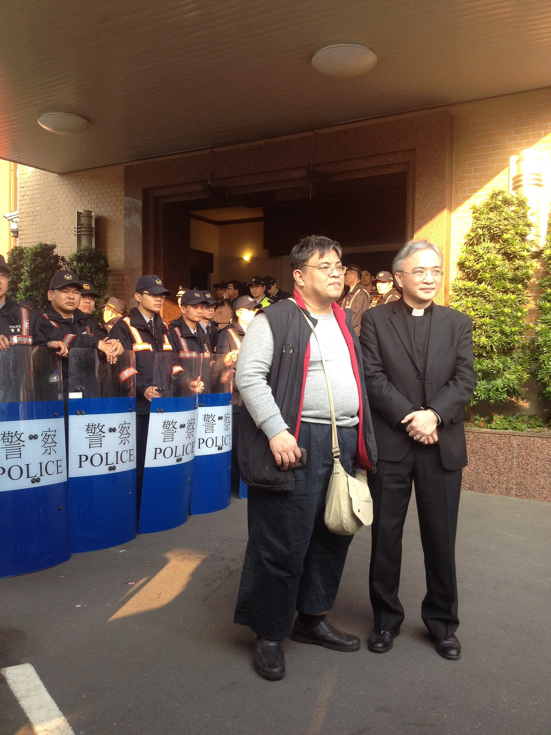
On March 23, 2014, protesters outside the Legislative Yuan chamber during the Sunflower Movement. Photo: Ray Swi-hy. CC BY-SA 2.0 via Wikimedia Commons.
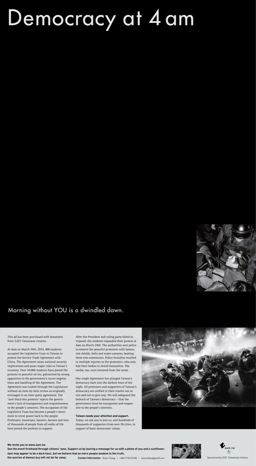
“Democracy at 4am,” the New York Times front-page advertisement published on March 30, 2014, designed by Aaron Nieh and completed through citizen crowdfunding. Image source: the advertisement file attached to The News Lens report (Aaron Nieh’s original draft, made available for free download through 4am.tw at the time), cited as fair-use editorial commentary.
Six years later, in April 2020, World Health Organization Director-General Tedros Adhanom Ghebreyesus accused Taiwan at a press conference of making personal attacks and engaging in racial discrimination against him. The next day, Ray Du, Aaron Nieh, Watchout’s Lin Tzu-i, Mazoo’s Chang Shao-lien, and Shasha77’s Chang Chih-chi, among others, launched an anti-Tedros New York Times crowdfunding advertisement10. The campaign surpassed NT$4 million in eight hours, ultimately raising NT$10.28 million from nearly 27,000 backers11. On April 14, the New York Times published the full-page advertisements “This Attack Comes From Taiwan” and “Who Can Help? Taiwan,” featuring a blue tunnel-like image with the letters “WHO” embedded in Taiwan’s entry and exit points9. In an interview with Central News Agency, Nieh said: “Print media is only the starting point; Taiwan’s desire to help the world cannot be distorted by Tedros.”9
Both advertisements were unpaid or low-paid projects. Both also pushed Nieh’s position in Taiwan’s design world from one of “the people best at making album covers” toward “the visual spokesperson for civic events.”
“Light Up Taiwan” and Two Presidential Inaugurations
Less than a year separated the 2014 New York Times advertisement from the 2015 contact with Tsai Ing-wen’s campaign office. In an ETtoday interview, Nieh discussed the decision behind the campaign identity project:
“The fact that they came to our studio means they probably already had some imagination in advance, because there was no way we were going to make something overly flashy.”3
“Light Up Taiwan,” which he created with Chen Hsun-chi, was the version among six sketches that Nieh himself said was “least likely to be selected”: a circular gradient background carrying only the words Light Up Taiwan, with the motion identity executed by WhiteLight Motion1213. The system later continued into Tsai Ing-wen’s 2020 reelection campaign and was used for the main visuals of the 2016 and 2020 presidential inaugurations, including commemorative inauguration beer cans, invitations, and a complete set of identity objects12.
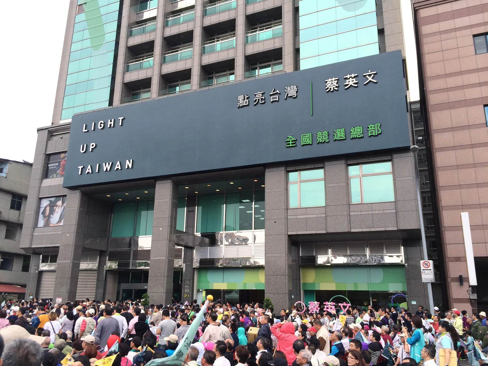
_In October 2015, the “Light Up Taiwan” identity system appearing at a Tsai Ing-wen presidential campaign rally. Photo: MiNe (Flickr). CC BY 2.0 via Wikimedia Commons._
In a 2016 conversation with cultural critic Chang Tieh-chih, Nieh explained in more abstract terms: “Because concrete things are stupid. If you want to establish elevation, you would rather be very abstract.”14 This line explains why the Light Up Taiwan design did not take the path of “green-camp color blocks plus the outline of Taiwan,” instead choosing a circular gradient and a line of English. It also foreshadowed why, ten years later, the Taipower logo storm would break open at the level of “preserving the lettering vs remaking it”: what he has always handled is the level of identity structure; the surface of the symbol is only incidental.
Leaving for Belgium and London: Escaping the “Too Comfortable Zone”
In September 2018, Nieh flew to the Royal Academy of Fine Arts Antwerp in Belgium to study in the graduate program in graphic design; in 2019, he transferred to the computational arts graduate program at Goldsmiths, University of London. He received a degree from neither institution2. Including an earlier program at the Graduate Institute of Applied Media Arts at National Taiwan University of Arts, he left all three graduate programs without completing them15.
But in an interview after returning in 2019, he described the motivation for leaving quite plainly[^18]:
“Staying in Taiwan’s design world, many things came too easily... This did not seem like a very normal environment. I felt it was too much of a comfort zone.”
The moment of departure came after the 2014 Sunflower Movement, 2015 Light Up Taiwan, the 2016 and 2020 presidential inaugurations, three Golden Melody wins for album packaging, and AGI membership. Before he flew away in 2018, he was already one of the designers most often named on lists of Taiwan’s design world. The two graduate-school periods in Belgium and London did not produce diplomas, but in his own description, a “resetting of coordinates” did occur.
A Beam of Light in a Pier-2 Warehouse and the Shape of the Studio
In July 2024, Aaron Nieh Workshop established a second base at Kaohsiung’s Pier-2. The site was a renovated First Bank warehouse in Kaohsiung: 3.8-meter-high concrete walls, original columns and beams retained, the warehouse’s old numbered lettering preserved, monthly rent of NT$42,000, and 28 ping of floor area16. Nieh said he chose the site because “everything just happened to fit”: the previous year, while curating the Taiwan Design Expo in Kaohsiung and staying long-term, he was “moved by a beam of sunlight.”
✦ “Everything just happened to fit.” — Aaron Nieh, 2023 ETtoday House interview16
The studio has two bases because the shape of its projects changed. In his portfolio in the early 2020s, state-owned enterprise and public-sector identity systems began appearing intensively: the 2020 identity for the Taiwan Design Research Institute’s elevation in status, the 2022 Ministry of Digital Affairs, the 2023 Ministry of Economic Affairs and Tourism Administration, the 2024 CPC and Taipower projects, and the 2025 Young Designers’ Exhibition and Taichung Green Museumbrary. These projects require teams, physical meeting space, and proximity to public-sector bodies in southern Taiwan.
In 2025, two works by Aaron Nieh Workshop were selected for the 2026 Golden Pin Design Award Best Design of the Year: the visual identity for Taichung Green Museumbrary (the architecture was designed by Japan’s SANAA and Ricky Liu & Associates, while the studio handled the complete brand extension) and the packaging for a series of OneSong Orchestra albums (ExAvantGarde and NewOldSchool)17. Both works had been delivered before the Taipower controversy erupted, and from the perspective of internal evaluation within the design community, they were among the few representative public-sector identity projects that did not provoke political controversy.
A Chain of State-Owned Enterprise Bids and the 2026 Taipower Logo Storm
The list of public-sector identity systems Aaron Nieh Workshop took on from 2023 to 2026 is as follows[^21]:
| Year | Tender | Contracting agency | Amount |
|---|---|---|---|
| 2023 | Identity system revision | Ministry of Economic Affairs | Not disclosed |
| 2023 | Identity system | Tourism Administration, MOTC | NT$1.48 million |
| 2024-01-15 | Identity optimization design | Taipower | NT$968,000 |
| 2024-05 | Logo optimization design | CPC | NT$980,000 |
| 2024 | 2025 Young Designers’ Exhibition | Kaohsiung Bureau of Cultural Affairs | NT$650,000 |
| 2025 | Visual identity | Taichung Green Museumbrary | Not disclosed |
Added to these are earlier projects for the Ministry of Digital Affairs (2022), the Taiwan Design Research Institute (at its 2020 elevation), the Control Yuan, and the Taiwan Pavilion at the Venice Architecture Biennale. In recent years, Aaron Nieh Workshop has become the most common name associated with “changing logos for the public sector.”
On May 8, 2026, the day Taipower’s new identity system went online, Kuomintang legislator Wang Hung-wei questioned: “As former president Tsai Ing-wen’s ‘imperial designer,’ during Tsai’s presidency he also became a regular in design tenders for various government bodies and state-owned enterprises.”18 The executive director of the Taiwan People’s Party’s Tainan city chapter criticized: “Change a typeface, tweak a logo, and comfortably make NT$960,000 of taxpayer money.”19 Political labels such as “green friend,” “political patronage,” “bluebird,” and “transitional justice” spread from NOWnews to eight Chinese-language media outlets1820.
Later that day, Nieh issued a five-point statement on his personal Facebook page, which later accumulated 31,000 likes, 2,355 comments, and 3,806 shares21. At the beginning, he directly identified the framing: “Let me first offer a quick and simple explanation, to avoid this being over-politicized and derailed by intentional politicians and media.” The statement’s argument had three layers. The first was a functional predicament: “Because the gap between early drafting and contemporary applications is enormous, there has long been an issue of inconsistent identity. For example, cast-iron maintenance-hole covers, transformer-box spray painting, very small printed matter, and three-dimensional carved-letter signs often need to be adjusted for different media.”21
The second layer was research into type history. He stated that the six characters in the original Taipower “Taiwan Power Company” lettering were not written continuously by Yu Youren himself: “Their source was separately taken from Yu Youren copybooks and then rearranged, scaled, and angle-adjusted, with computer tracing and edge processing performed afterward; they were not custom-written by Mr. Yu specifically for Taipower.”21 The third was the layer of inheritance. He said the new standard lettering “still incorporated connections to the central structure and terminal characteristics of the type in Yu Youren’s original model-copybook characters,” with the design goal of preserving the visual DNA21. The statement also responded to the budget and “why is it you again?” accusations: “A project of around one million dollars stretched over a year and a half... is indeed far below our market rates for corporate and brand clients”22; “If someone does better than us, surpasses us, and wins the bid, I would actually be sincerely convinced and very happy!”; and “We really do very few government-agency projects, Amitabha.”21
✦ “Regardless of the tug-of-war over preferences brought about by the result, we delivered our professionalism, with a clear conscience.” — Aaron Nieh, May 8, 2026 five-point statement23
![]()
The design process for Taipower’s new standard lettering, publicly disclosed by Aaron Nieh in a Facebook post on 2026/05/08. On the left are Yu Youren’s original copybook characters; on the right is the new typeface, with the comparison of central structure and terminal characteristics clearly visible. Image source: Mirror Media report (screenshot from Aaron Nieh’s public Facebook post), cited as fair-use editorial commentary.
At 14:36 that afternoon, China Times published a rebuttal from Huang Chih-yang, dean of the College of Humanities and Arts at Huafan University24. Huang cited the article “Old Master Yu’s Calligraphy and Taipower” from issue 25 of Taipower Monthly, dated January 1, 1965, which recorded that in 1953, then-Taipower general manager Huang Hui personally invited Yu Youren to inscribe “Taiwan Power Company” and “Service Office” for Taipower. Yu did indeed personally write the characters; only the original manuscript’s “right-to-left” arrangement was changed to “left-to-right.” Huang called Nieh’s account “an evasive and highly unprofessional misleading phenomenon,” and said that “personally inscribing the characters for Taipower is a historical fact, and the public cannot be opportunistically misled because of a commercial misjudgment.”24
Nieh did not issue a further response on May 8 to this evidence from the 1965 internal publication. The controversy then continued to spread across social media and political circles until May 12, 2026, when it reached the Legislative Yuan’s Education and Culture Committee. Culture Minister Li Yuan (Hsiao Yeh) responded for the first time, saying that design and aesthetics are professional fields involving historical memory and personal feeling, and should be returned to professional assessment. He also emphasized that this and corporate operating conditions, such as electricity-price adjustments and losses, belong to different levels of issue25. Taipower later issued a supplemental explanation, stressing that it would adopt a buffer plan of “integrating old and new”: existing physical facilities across Taiwan, such as building signs and manhole covers, would keep the original calligraphic typeface and no additional budget would be allocated for replacement; the new identity system would mainly be applied to digital interfaces, new electricity bills, and future newly procured equipment26.
“Citizen Aaron Nieh” and “Designer Aaron Nieh”
A line often quoted from Nieh comes from a La Vie interview in June 2020[^8]: “before he was designer Aaron Nieh, he was citizen Aaron Nieh.” In the same interview, he also discussed the tension between commercial projects and “cool”:
“I still really like making cool things, but commerce cannot satisfy me. No one gives me money to make cool things. But I have to achieve psychological balance.”6
“Those beautiful things are all safe and harmless, but is that my real persona? No. I am only honestly saying what my persona is.”6
This self-articulated order of “citizen before designer” is clear in the scenes of the 2014 Sunflower Movement, the 2020 Taiwan Can Help campaign, and Tsai Ing-wen’s 2016 and 2020 campaigns and inaugurations: he used his professional obligations as a designer to serve civic events. But the four consecutive state-owned enterprise tenders from 2024 to 2026 placed this order back into a commercial position: what critics asked was, when a designer takes on government-funded identity-system projects, to what extent can the “citizen” identity remain independent from the commissioning party?
Nieh’s own response in the five-point statement he issued on May 8, 2026, was: “This project has nothing to do with politics, and they have also worked with teams from different political parties; they have a clear conscience and have given their full effort.”27 He cited recent Aaron Nieh Workshop collaborations with “teams from different political parties”: Taichung Green Museumbrary (Lu Shiow-yen, Kuomintang), the Taiwan Design Expo in Changhua, and the Museum of Contemporary Art Taipei22.
📝 Curator’s note: “Citizen before designer” is the discursive order Nieh himself chose in a 2020 La Vie interview. But “citizen” and “designer” have always been the same profession in his career trajectory, merely appearing from different angles in different projects. When Nieh made the Sunflower Movement’s New York Times advertisement, he was both a citizen and a designer; when he made the Taipower logo, he was both a designer and a citizen. When critics ask whether the two can be separated, they are really asking about the weight ratio of the same profession along two axes of commission: when civic-obligation projects and commercial government projects sit side by side on the studio’s project list, by what standard should the outside world judge? This is the proposition that has continued to emerge over Nieh’s twenty-year career. His own answer, the labels given by media, the accusations given by critics, and the rebuttals given by scholars of type history were still pulling in different directions in 2026.
The Name Aaron Nieh Workshop
The studio name “Aaron Nieh Workshop” in Chinese, Yongzhen Jizhi, contains a pun: “Yongzhen” is his given name, while “jizhi” is a homophonous substitution for “design” in Chinese and also alludes to the speed and timeliness of design work. After operating in Taipei for many years, the studio added a second base at Kaohsiung’s Pier-2 in 2024. Nieh is often seen as a “personal brand,” but in reality, Aaron Nieh Workshop’s collaborators over two decades have included Chen Hsun-chi, WhiteLight Motion (Hung Yu-tang), type designers (for the Taipower project, professional type designers were commissioned to assist with adjustments21), photographer Wing Shya (Golden Horse 50), and multiple graphic designers whom he has referred to in interviews as “colleagues.”
If Aaron Nieh Workshop’s project catalogue were printed out, it would run from Sodagreen’s Autumn: Stories and Yoga Lin’s Fiction to the anti-Tedros New York Times front page, from Tsai Ing-wen’s 2016 Light Up Taiwan to the 2025 Taichung Green Museumbrary, from the Taipower logo to OneSong Orchestra albums, crossing nine industries: pop music, publishing, books, commercial branding, civic movements, political campaigns, national identity, art spaces, and international exhibitions. This breadth itself is the real background to all discussion when the Taipower controversy occurred on May 8, 2026: Aaron Nieh is one of the key nodes in the formation of Taiwan’s visual language after the 2000s, a studio that has simultaneously designed for every industry.
In the final paragraph of BIOS monthly’s “Trolley Problem,” Nieh said: “Setting aside politics, every project will encounter this kind of thing.”4 Political projects have higher visibility, but the essence of commission ethics is the same in every commercial project. He will continue taking commissions and continue facing the question of “citizen Aaron Nieh vs designer Aaron Nieh.” The studio’s twenty years tell readers: the question itself is the core of the work.
Further reading:
- Tsai Ing-wen — the other end of the Light Up Taiwan campaign identity and two inaugurations, tracing the context of political design commissions from 2016 to 2024
- Sunflower Movement — the historical scene of the 4 a.m. New York Times advertisement in 2014
- Taiwan New Media Art — the position of Aaron Nieh Workshop within Taiwan’s contemporary visual culture
References
Image Sources
This article uses five images, all cached in public/article-images/people/ to avoid hotlinking source servers. The first three are Wikimedia Commons CC-licensed images, and the final two are fair-use editorial-commentary citations of publicly available media files directly related to public discussion of Aaron Nieh’s design works:
- hero: Aaron Nieh 2018 — Photo: Gene Wang (Flickr user 56814157@N03), 2018-03-16, CC BY-SA 2.0
- inline 1: Sunflower Movement 20140323 Legislative Yuan — Photo: Ray Swi-hy (Flickr), 2014-03-23 17:03, CC BY-SA 2.0
- inline 2: “Democracy at 4am” New York Times front-page advertisement (2014-03-30) — Design: Aaron Nieh, made available for free download through 4am.tw at the time; image file from The News Lens report (i-Chen Tsai 2014/03 blog archive version) — fair-use editorial commentary citation (citizen-crowdfunded work + publicly disseminated by the designer according to original intent)
- inline 3: Tsai Ing-wen presidential campaign, 2016 — Photo: MiNe (Flickr), 2015-10-18, CC BY 2.0
- inline 4: Aaron Nieh’s Taipower new standard-lettering design process (2026-05-08) — Screenshot from Aaron Nieh’s public Facebook post (verified account @somekidding), image file hosted by Mirror Media report — fair-use editorial commentary citation (public post + disclosure of logo design process for a public issue)
- Aaron Nieh Wikipedia — Structural information on Aaron Nieh’s life, education, awards, year of AGI admission, the three Golden Melody Award album-packaging wins (21st, 25th, and 26th), and book and record collaborators including Lo Yi-chin, Gan Yao-ming, Rye Field, China Times Publishing, INK, and Linking Publishing.↩
- Cheers: A Happy Worker: Studied in three graduate programs without obtaining a degree — Interview on Nieh’s experiences leaving three graduate programs unfinished (NTUA Graduate Institute of Applied Media Arts, Royal Academy of Fine Arts Antwerp, and Goldsmiths, University of London), including the verbatim quote “More important than getting a diploma was knowing that I had gained something.”↩
- ETtoday 2015-05-22: Exclusive / Handling Tsai Ing-wen’s campaign visuals — Exclusive interview with Aaron Nieh on the “Light Up Taiwan” campaign identity, including the verbatim quotes “there was no way we were going to make something overly flashy” and “designing visual identity is, by nature, about ‘abstracting’ concrete things.”↩
- BIOS monthly 2017-10-30: Aaron Nieh’s Trolley Problem — In-depth interview by Wei Jen-hsiang, including Nieh’s ethics framework for taking commissions: “I will do it only when the proportion of values I identify with is high enough,” “I do not take awful jobs with extremely low pay,” and “setting aside politics, every project will encounter this kind of thing.”↩
- Vogue Taiwan 2023: AGI admits three more Taiwanese members this year — Organizes the historical list and admission sequence of Taiwanese AGI members: Aaron Nieh in 2012, Wang Zhi-hong in 2015, Lin Xiao-yi and Ho Chia-hsing in 2017, and Yeh Chung-yi in 2023.↩
- La Vie 2020-06-16: Aaron Nieh’s style, aesthetics, and design: “I like making cool things” — Original source containing five verbatim quotes: “commerce cannot satisfy me,” “those beautiful things are all safe and harmless,” “before he was designer Aaron Nieh, he was citizen Aaron Nieh,” “beautiful design does not necessarily get circulated,” and “safe design is easily forgotten.”↩
- The News Lens 2014: Democracy at 4am: Sunflower Movement advertisement appears in The New York Times — Report on the design concept, fundraising process, and full advertisement image for the Sunflower Movement New York Times advertisement published on 2014/03/30.↩
- Business Today 2014: Taiwanese designer places movement advertisement in The New York Times, voicing civic sentiment — Includes specific information on the advertisement’s fundraising amount, placement, and front-page location in The New York Times.↩
- Central News Agency 2020-04-14: Anti-Tedros crowdfunded New York Times advertisement published; Aaron Nieh reveals design concept — Includes comparative references to the 2014 Sunflower New York Times advertisement fundraising amounts (NT$1.5 million in 35 minutes, NT$6.33 million in three hours), as well as the verbatim quote from the 2020 anti-Tedros advertisement “Print media is only the starting point; Taiwan’s desire to help the world cannot be distorted by Tedros,” the advertisement layout, and the New York Times placement.↩
- Business Next 2020-04: Ray Du and Aaron Nieh crowdfund New York Times ad, raising NT$4 million in eight hours — Report on the timeline from the launch of the 2020/04/09 anti-Tedros New York Times advertisement crowdfunding campaign to surpassing NT$4 million in eight hours, and on the composition of the initiating team.↩
- zeczec: ThisAttackComesFromTaiwan crowdfunding page — Original crowdfunding page, including the amount (NT$10.28 million), number of backers (nearly 27,000), full list of the initiating team, and usage notes.↩
- Democratic Progressive Party 2016: Light Up Taiwan — DPP’s official explanation of the 2016 Tsai Ing-wen campaign identity, including the design-team composition (Aaron Nieh Workshop + Chen Hsun-chi + WhiteLight Motion), the system’s continuation into the 2020 reelection campaign, and the context of the main visuals for two inaugurations.↩
- WhiteLight Motion: Light Up Taiwan motion identity — Motion-identity case study, including complete animation presentation and design-process explanation.↩
- Business Next 2016-05-01: Aaron Nieh × Chang Tieh-chih and Chen Sheng-chih, drivers of a revolution in political aesthetics — Original conversation source containing the verbatim quote “Because concrete things are stupid. If you want to establish elevation, you would rather be very abstract.”↩
- Crossing: The Aaron Nieh you do not know: an internationally renowned design path that began with mechanical drafting — Another interview source on Nieh’s educational trajectory, including the path from mechanical drafting at National Taichung Industrial High School to industrial and commercial design at NTUST.↩
- ETtoday House 2023-12-15: Because of a beam of light, Aaron Nieh rents First Bank’s Kaohsiung warehouse — Context for Aaron Nieh Workshop’s second base at Kaohsiung’s Pier-2, including the specific spatial data of 28 ping, NT$42,000 monthly rent, and 3.8-meter ceiling height, and the verbatim quote “everything just happened to fit.”↩
- Openbook: Simplicity is contemplation of complexity; Aaron Nieh handles Taichung Green Museumbrary — Design interview on the visual identity system for Taichung Green Museumbrary, including the co-constructed architectural context of SANAA and Ricky Liu & Associates, and the background of the 2026 Golden Pin award.↩
- NOWnews 2026-05-08 09:30: Hoping to stop the manipulation of political hatred — The earliest 09:30 media report on the day Taipower’s new logo went online, including legislator Wang Hung-wei’s specific questioning about Aaron Nieh Workshop’s consecutive tenders and the verbatim phrase “imperial designer.”↩
- Meihua News: Exposed as winning nearly million-dollar Taipower and CPC tenders, while supporting mass recalls; Aaron Nieh: clear conscience — Includes the full context for the Taiwan People’s Party Tainan city chapter executive director’s criticism: “Change a typeface, tweak a logo, and comfortably make NT$960,000 of taxpayer money.”↩
- Mirror Media 2026-05-08: Taipower spends NT$960,000; Aaron Nieh accused of being a green friend — Report on the controversy after Taipower’s new identity system went online on 2026/05/08, including accusations of “political patronage” and “green friend,” summaries of Nieh’s statement that day, and the specific origins of online labels such as “bluebird” and “transitional justice.”↩
- Aaron Nieh 2026-05-08 public Facebook post — Aaron Nieh’s complete original post formally responding to the Taipower logo controversy (verified personal account @somekidding). As of the evening of 2026-05-08, it had 31,000 likes, 2,355 comments, and 3,806 shares. Includes the opening about being “derailed,” the three-layer type-history argument, the list of concrete application scenarios such as cast-iron maintenance-hole covers, the narrative of inheritance through central structure and terminals, examples of cross-party projects, and the closing line “We really do very few government-agency projects, Amitabha.”↩
- Business Today 2026-05-08: Taipower logo, six characters, NT$1 million easy money? — Another published source for the full text of Nieh’s five-point statement, including the verbatim quotes “around one million dollars stretched over a year and a half” and “If someone does better than us,” as well as the names of recent Aaron Nieh Workshop collaborations with teams from different political parties cited by Nieh (Taichung Green Museumbrary, Taiwan Design Expo in Changhua, Museum of Contemporary Art Taipei).↩
- United Daily News 2026-05-08 08:53: Incorporating features of the Yu Youren version; delivered professionalism with a clear conscience — Full text of Aaron Nieh’s five-point statement, including the verbatim quote “with a clear conscience” and the designer’s interpretation of the old logo’s typeface version.↩
- China Times 2026-05-08 14:36: Scholar cites evidence that Aaron Nieh misled, “evading the important points” — Huafan University College of Humanities and Arts dean Huang Chih-yang cites the article “Old Master Yu’s Calligraphy and Taipower” from issue 25 of Taipower Monthly in 1965 to rebut Nieh’s interpretation of the source of Taipower’s old logo lettering, including the verbatim quote “an evasive and highly unprofessional misleading phenomenon.”↩
- Central News Agency 2026-05-12: Taipower logo typeface controversy; Culture Minister Li Yuan says design is professional and should “return to professionalism” — Culture Minister Li Yuan’s remarks during an interview at the Legislative Yuan on May 12, 2026, emphasizing the independence and professionalism of design value.↩
- FTV News 2026-05-12: Taipower identity optimization sparks controversy; official clarification says “old and new will coexist,” old signs will not be replaced — May 12, 2026 report containing details of Taipower’s adjusted implementation plan in response to public pressure.↩
- Liberty Times Net Finance 2026-05-08: Taipower’s new logo criticized as political patronage; Aaron Nieh’s five-point statement — Full published version of the five-point statement issued by Aaron Nieh at 11:36 that morning, an early source for multiple media repostings on 2026/05/08, including the verbatim quote “This project has nothing to do with politics, and they have also worked with teams from different political parties.”↩